Huawei Cloud Quietly Updates Website with New UI Elements
Recently, I’ve been working on a platform for data governance. When I was browsing through Huawei Cloud’s database products a week ago, I noticed that the site appeared to be slightly different.
Today, I revisited the site to check again. Indeed, Huawei Cloud has quietly updated its Chinese website, page by page, with new UI elements. However, its international sites retain the original design.
First and Foremost, Exploring Chinese Cloud Providers
In China, the top five Cloud Service providers have a similar design style: tech, 3D/2.5D, and light.
It’s hard to recognize without a brand color color system.
Furthermore, it appears that due to the multi-product, multi-page, multi-country nature of their site, they have an inconsistent design system of their own.
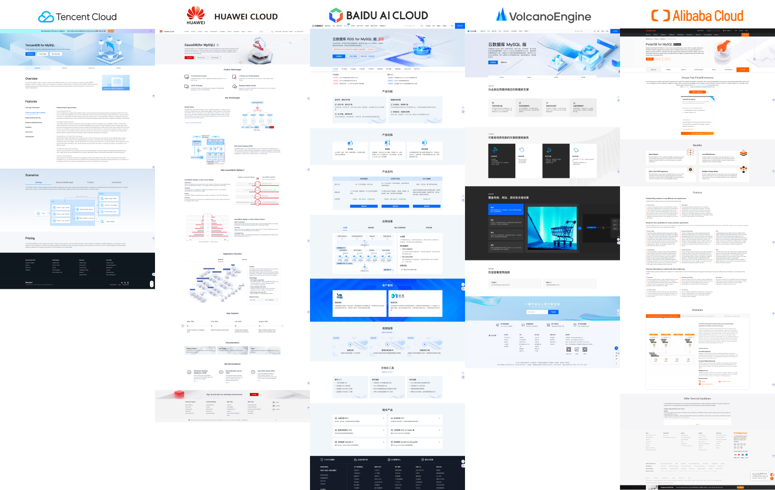
1. Banner
They all prefer to use 3D elements, often accompanied by animations, to showcase their products.
1.1 VolcanoEngine Cloud
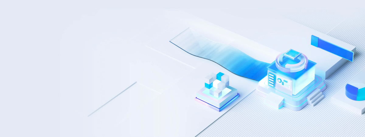
1.2 HUAWEI Cloud
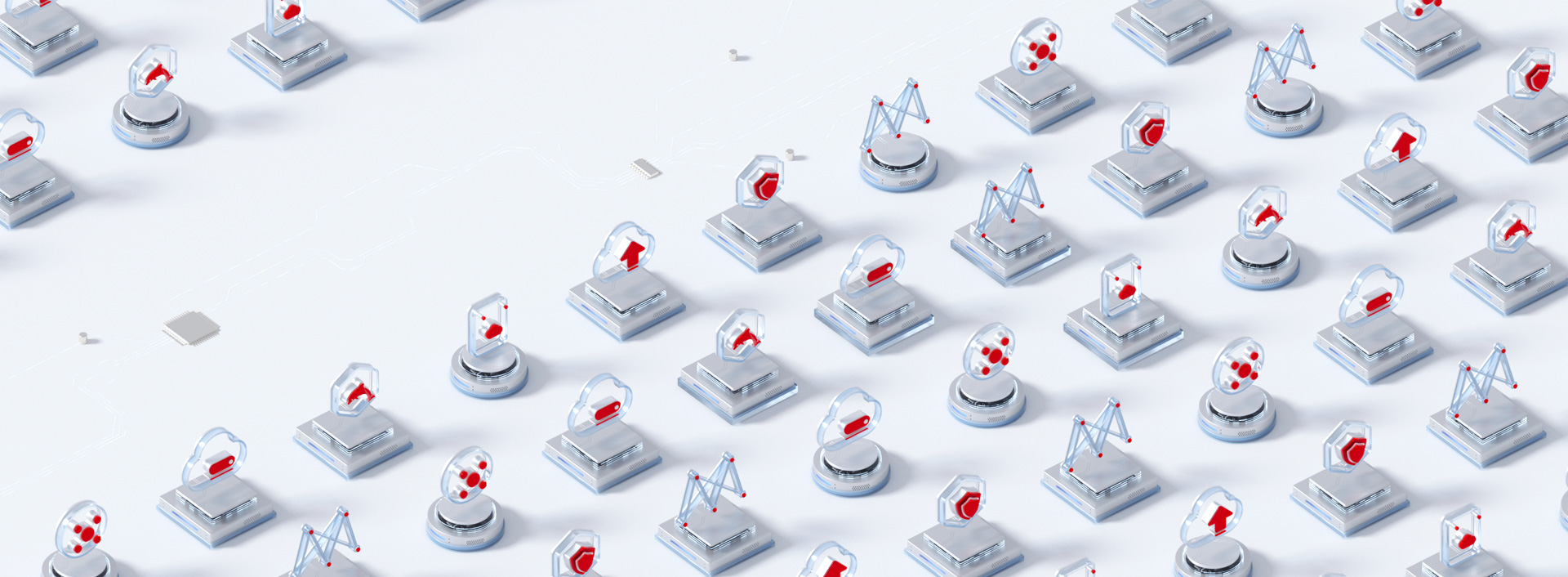
1.3 BAIDU AI Cloud


1.4 Tencent Cloud
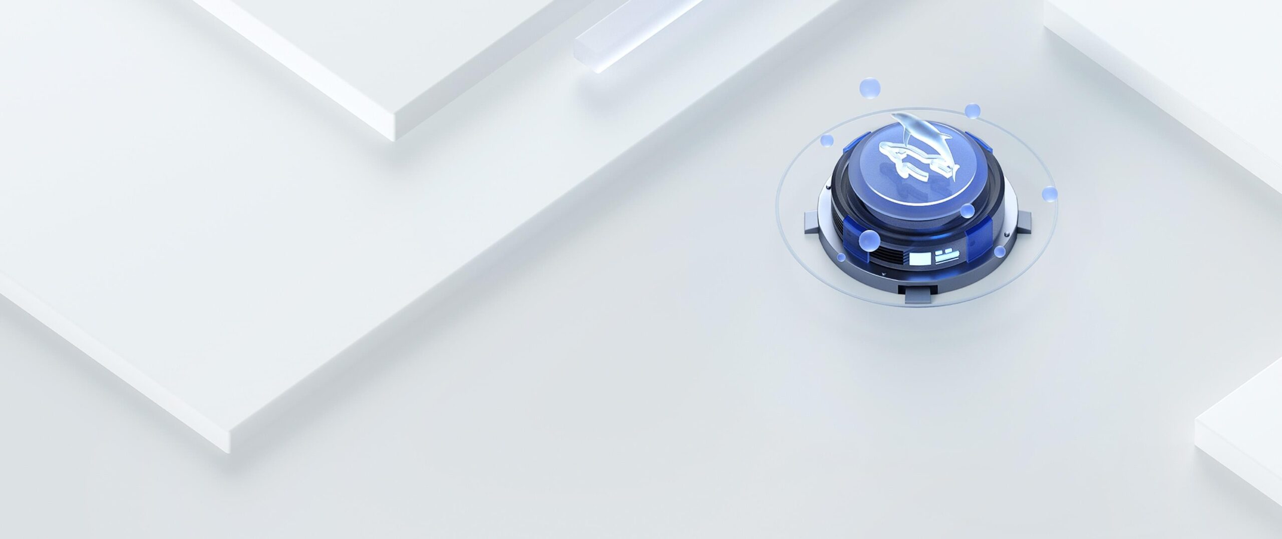
1.5 Alibaba Cloud


The international site has a metal material design style on some primary pages.

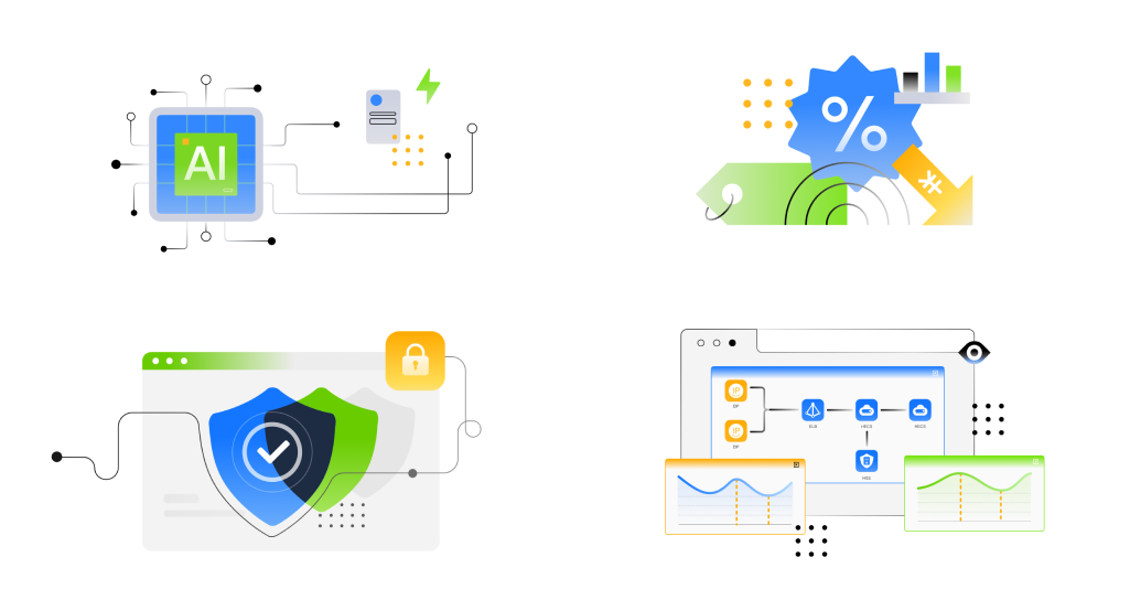
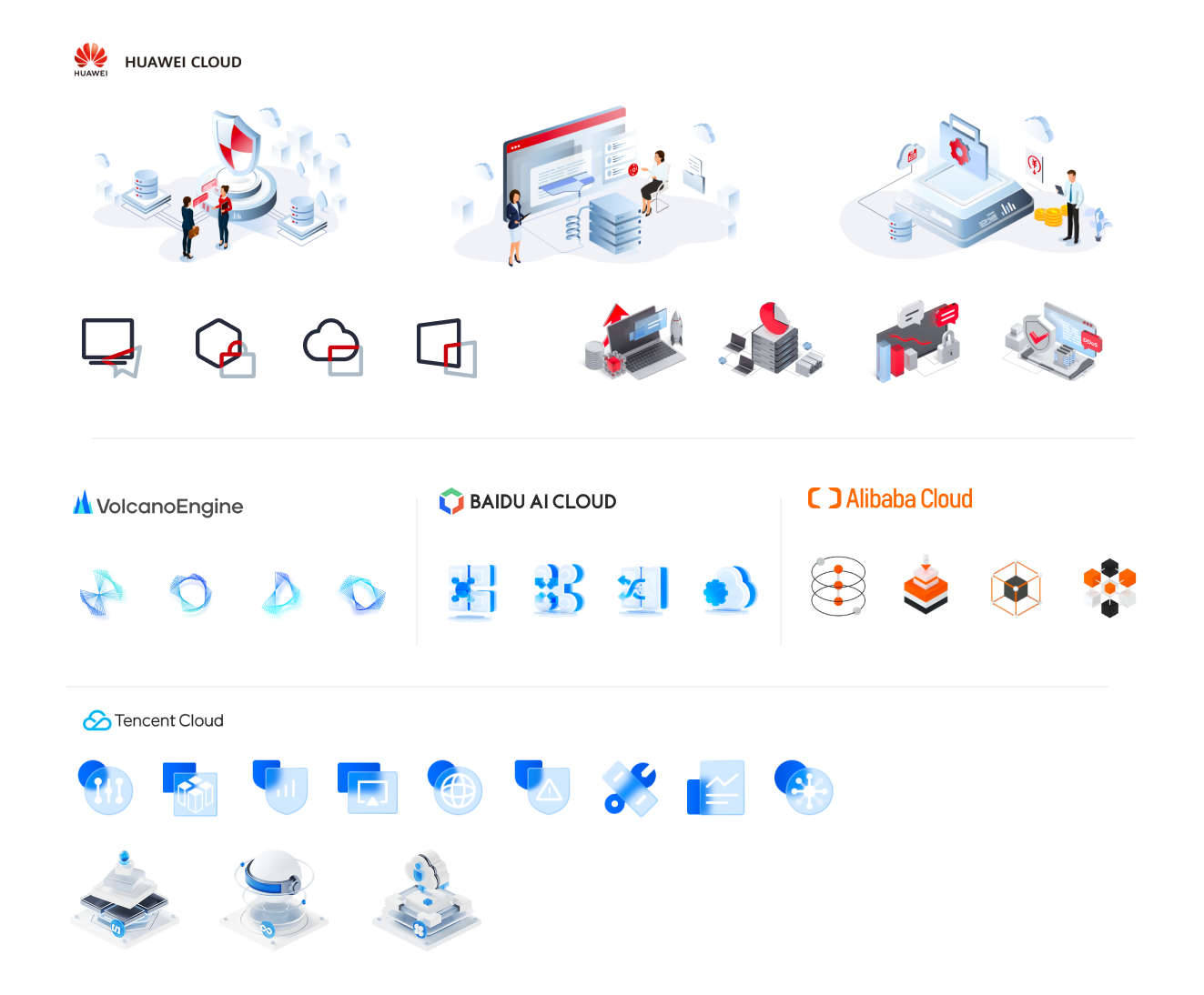
2. Product Advantages icons
The main design style comprises 2.5D, 3D, and animated icons.
2.5D, and 3D, animated icons are the main styles. However, Huawei Cloud and Tencent Cloud have combined these elements in diverse ways across various pages and country-specific sites.
Now, Huawei Cloud Quietly Updates Website with New UI Elements
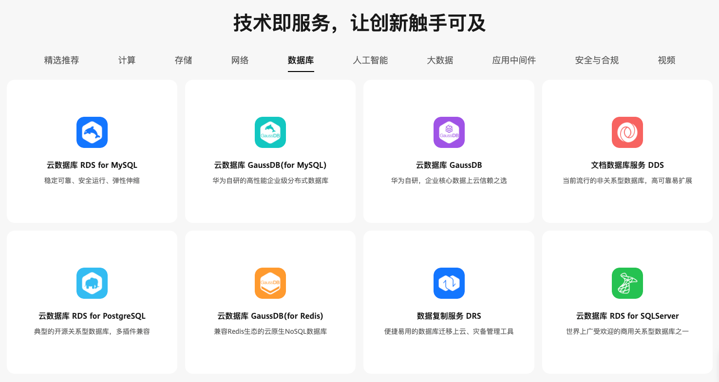
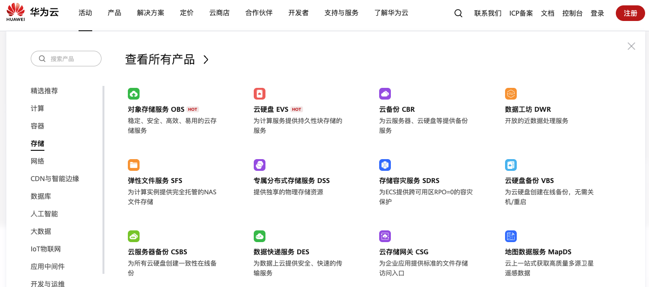
On the homepage, the product icons are now more colorful and fresh compared to before and hover the “Products” of the top menu, a dropdown list with the new icons will appear.
Top Menu > Products Dropdown List
After inspecting the HTML code, I noticed the keyword “new-home” in the URL and confirmed my guess.
<div class="product-card-inner">
                    <img class="" src="https://res-static.hc-cdn.cn/cloudbu-site/china/zh-cn/yunying/new-home/product/hecs-light.png">
                    <h5>云耀云服务器L实例</h5>
                    <p>简单上云第一步</p>
</div>
It seems that the new style started at HDC. Cloud 2023-HUAWEI DEVELOPER CONFERENCE 2023, similar colors are used on the event page. https://developer.huaweicloud.com/en-us/HDC.Cloud2023.html

As I mentioned at the beginning, they can’t unify the design style of the whole site at once. Only a few pages and elements are changed on the Chinese site first.
1. ICON
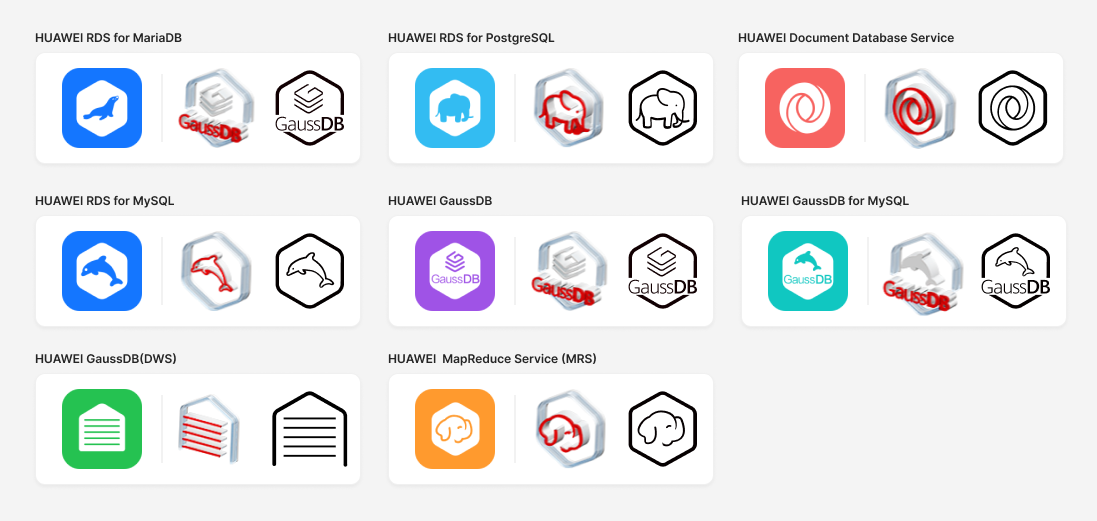
The product icons on the homepage and some product pages are updated. Now, Huawei Cloud has three style icons online.
- The flat and 3D icons are in PNG format.
- The outline icons can be downloaded as an SVG package online. https://www.huaweicloud.com/intl/en-us/service/icons.html
2. Banner
Some banners are designed with the new style. 3D animation is still popular.

3. Product Advantages icons
Huawei Cloud has also redesigned Product Advantages icons with gradient colors, but personally, I find them less appealing as they don’t convey a very clean look. But perhaps soon, another design will appear on another page.
